
Stream with confidence
The Roku Channel content indicators
Role
Product Design Lead
Timeline
4 months
Introduction: Enhancing UX in The Roku Channel's Growing Library
As The Roku Channel's library grew, it became crucial to refine how different content types, especially entitlements, were presented to users. The aim was to ensure the interface remained straightforward and intuitive, reinforcing user trust by simplifying access to a diverse range of content without compromising on clarity.
Background: Evolution of Content Indication
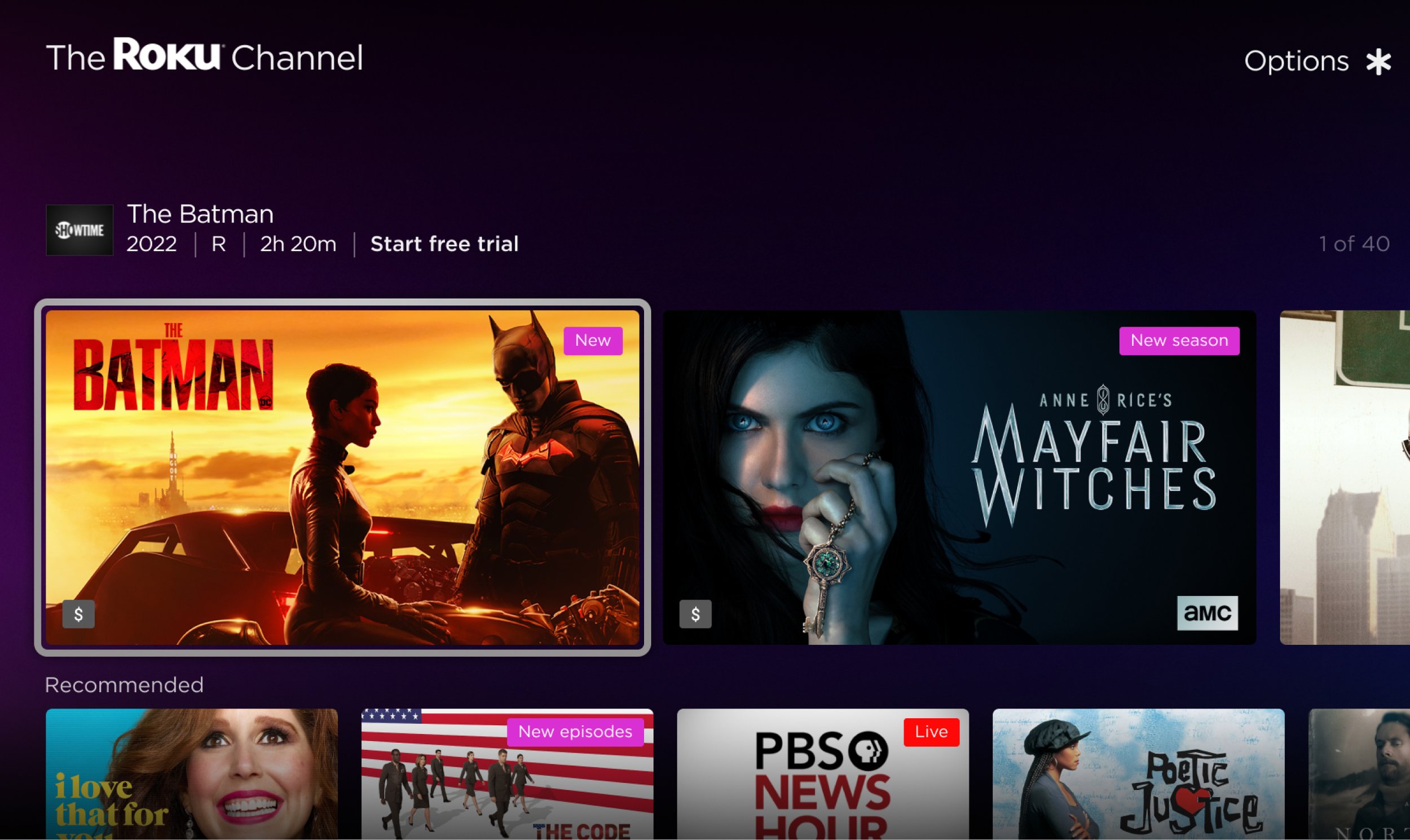
Previously, the method for indicating content status on the platform was quite tactical, focusing on specific, immediate needs. For instance, introducing live content necessitated a "Live" indicator based on program requirements. Over time, additional indicators such as "Season Premiere" and "Newly Added" were introduced, often stemming from the editorial team and product management's individual requests, and these were manually incorporated into the content imagery to inform viewers.
Challenges: Rethinking Content Indicators

Initially, I recommended short-term, manual solutions for managing content indicators. However, recognizing the need for a sustainable strategy, I developed a comprehensive approach that diverged from our competitors, such as Amazon Prime Video, which we aimed not to emulate. This new strategy focused on UX considerations to reduce visual clutter and cognitive load, avoiding the overuse of badges that could overwhelm users and dilute the interface's meaning. It aimed to balance legal requirements and user needs, enhance content discovery, and maintain trust by preventing frustrating or misleading UI experiences.
Design Challenges: Balancing Clarity, Visibility, and Legal Considerations

Entitlement
When I addressed the entitlement design, I encountered resistance from cross-functional team members. My original plan focused on marking content that required a subscription or trial with a universally recognized currency icon. Stakeholders were concerned that this approach might overly emphasize paid content, potentially sidelining free offerings. The idea behind using a monetary symbol was its clarity and directness, eliminating user ambiguity.

Legal
Concerns about intellectual property and content artwork also surfaced. Some worried that placing indicators over the artwork might infringe on legal rights. Proactive strategies were considered to address potential issues without compromising the design's integrity.
Building on my experience with content partnerships, I took the initiative early on by working with Engineering to implement a feature that could deactivate badge overlays in case of complications. Our legal team and external content partners appreciated this foresight during the mitigation plan presentation, acknowledging our proactive approach.
Visibility / Prioritization
The visibility and prioritization challenge involved managing how indicators were displayed to avoid overwhelming the users. The goal was to effectively strategize the placement of various indicators within the UI, determining which could be relocated or emphasized differently to address these challenges.
Strategic Overhaul: From Discovery to Design
Initial discovery
User testing insights (entitlement)

Amazon Prime Video
Competitive benchmarking against Amazon Prime Video highlighted challenges in distinguishing between free and paid content. Users often miss signals indicating content status, leading to frustration upon discovering payment requirements post-selection. While a Prime banner suggested free access, user confidence wasn't absolute, underscoring the need for clearer communication.

The Roku Channel
Feedback from The Roku Channel users echoed the need for a more explicit distinction between paid and free content. While certain UI elements, like the back-of-box header, provided some guidance, their effectiveness was limited by visibility constraints and user expectations. Integrating mixed entitlement content within the same UI elements contributed to confusion, suggesting a need for more reliable indicators of content status.
Indicator audit

Auditing existing content indicators involved collaboration with stakeholders to identify and brainstorm potential future indicators. This process included organizing the indicators into logical categories and setting the groundwork for a systematic indicator management and development approach.

Prioritizing specific content indicators was plotted against their required visibility within the user interface. This visual representation aimed to balance the prominence of various indicators, ensuring that key information is communicated effectively without overwhelming the user experience.
Design
In proposing initial designs for a revised indicator system, consideration was given to leveraging color as a means for users to understand what each badge signifies quickly. The strategic placement of badges, such as always situating a specific badge in the upper right corner of a tile, would signify time-based content, aiding in user recognition.
Additionally, the content within the badge, whether through text or symbols, plays a crucial role in conveying the intended message. Discussions around the feasibility of displaying multiple badges on a single tile also took place, evaluating potential relevance or redundancy among badge combinations and determining the likelihood of their occurrence.

The entitlement problem
When addressing the challenge of signaling paid content, the straightforward approach faced resistance due to concerns over user reaction to seeing numerous dollar sign badges. Collaborating with designers across different business units led to a nuanced strategy: Rather than highlighting what content was not available for free, the focus shifted to marking accessible content. This approach aimed to minimize screen clutter with badges, which would only become visible in the content's focus state, striking a balance between user information needs and clarity.

Implementation: Establishing a New Standard for Content Indicators

Referencing the indicator audit, each taxonomy helps categorize each type of indicator and helps scale future sub-categories.

Strategic positioning of badges on tiles was a significant design discovery, enhancing user comprehension and pattern recognition. For instance, a badge in the upper right corner signifies time-based information, whereas one in the bottom left indicates entitlement, simplifying the user's learning curve.

Finally, in addition to grouping by taxonomy and positioning, color could be used to group and aid in quick badge identification. It could also be leveraged for branding purposes.
My initiative ultimately achieved the following outcomes: It established a systematic design methodology that enhances users' ability to recognize patterns, quickly identify content types, and comprehend their options, aiming to boost engagement and streaming duration. It also prompted our team and the wider organization to acknowledge how cognitive overload and visual clutter affect user trust and brand perception. Although I had moved on before the project was finalized, as a user of Roku, I've noticed the team tackled one of the significant challenges I pinpointed: an unambiguous symbol for entitlement.

Next steps
The plan includes developing a timeline for implementing each type of content indicator as part of a programmable solution for the next steps. This also involves conducting stress tests to understand the impact of localization on design, how multiple badges interact, and how they integrate with the 2:3 aspect ratio tiles used for content display. This approach ensures the design remains effective and user-friendly across different regions and content presentations.

Metrics
The initial manual implementation of content badging resulted in a significant increase in click-through rates, ranging from 15-25%. However, it remains to be seen how these improvements in engagement translated into actual streaming hours, suggesting a need for further analysis to understand the impact on viewer behavior fully.