Designing for subscription growth
For The Roku Channel
Role
Product / Visual Designer
Timeline
11 months
Strategic shift: Launching The Roku Channel
In 2017, Roku expanded its business model by launching The Roku Channel, a free, ad-supported streaming service. This strategic shift capitalized on Roku's reputation for affordability and simplicity in its operating system, which kept hardware production costs low and the user experience streamlined. The Roku Channel quickly became a significant revenue driver, amassing $1.3 billion between its launch and 2019, surpassing OS licensing and hardware sales earnings.
Core experience: Easy and free
At the heart of The Roku Channel was a commitment to simplicity. Users could easily search for or browse content within the app, enjoying free access sprinkled in with minimal ad breaks. This straightforward, user-friendly approach formed the core of Roku's value proposition in the streaming sector.
Growth opportunity: Partnerships with premium content providers
A pivotal opportunity emerged when Roku partnered with premium content providers like Starz and Cinemax. These partnerships promised to enrich the streaming app’s library with highly coveted original series and films, potentially attracting new users.
Resource advocacy and team collaboration
Despite the project's scope, impact on user experience, and profitability, initial design resources were minimal. Alongside my Design Lead, extensive discussions were held with cross-functional teams to align on project scope, timelines, and resource needs, advocating for additional UX support. My contributions to this process leveraged my domain and institutional knowledge to give meaningful estimations of how long each design phase would take. In addition to resourcing, we encountered several other obstacles:
New team member
As a tenured team member of the organization, I also facilitated the new Design Lead's onboarding by ensuring he was well-versed in Roku's UX best practices by sharing critical documentation. Anytime he had questions about the feasibility or behavior of specific UI patterns, I would take the time to discuss them in detail. In addition, I also connected him with crucial engineering staff.
Business requirements
The need for publisher home pages to satisfy brand attribution requirements is a shift from the usual content presentation under The Roku Channel brand.
User requirements
I addressed user skepticism about paying for content by emphasizing the value of subscriptions through image-focused designs and clear, engaging calls to action based on emotional design principles (Don Normal, Emotional Design).
Technical constraints
Resolving the small appetite for a more immersive, large-scale presentation of rich content imagery, fear that it would be out of scope and push content rows further down the fold.
Initial designs for subscriber engagement
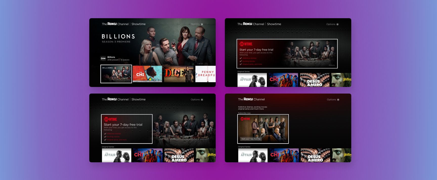
Design solutions for the partner home page
Pre-subscription state:
I proposed multiple concepts ranging from full-screen background images that prioritized the call to action as the primary goal of the page for users. Practicing pragmatism, I also made sure to propose other solutions that repurposed existing UI patterns. Somewhere in between the spectrum of solutions, where slight changes of behavior or appearance of current UI patterns, where the scope wasn’t significant, but the OS gained value by adding new capabilities. Each solution had its pros and cons, from technical to meeting user-centered design principles.

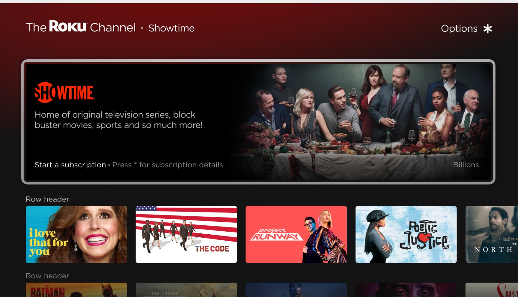
Post-subscription state:
I developed branding solutions to maintain publisher attribution post subscription, integrating partner logos and brand colors within the UI.
A more significant presence of the partner’s branding and marketing, but at the cost of pushing some of the content rows below the fold.
Bare-bones solution, making sure that the text breadcrumb would scale based on variations of partner name length
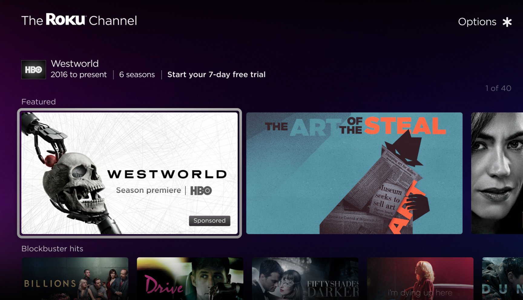
Promotional opportunities:
Leveraged promotional events like season premieres to refresh the app's appearance and engage users, enhancing the visibility of new content and the appeal of the broader library.
Strategic partner integration and onboarding
A critical phase was ensuring that our content partners were seamlessly integrated and could thrive within The Roku Channel's ecosystem. I assisted with developing comprehensive design guidelines with the Design Lead, Marketing, Tooling, and Partner Management teams, which evolved into a detailed design and developer portal.


After a year of collaborative efforts, we onboarded 27 content partners to The Roku Channel, surpassing our goals to boost competitive presence in the streaming market. Our focus on integrating premium subscription content significantly enhanced user engagement and contributed to an 8.1% increase in annual revenue. This success highlights our capacity to innovate and drive impactful business outcomes.


