
Design vision driving strategy
RokuTV OS
Role
Product / Visual Designer
Timeline
3 months
Strategic Vision
Years before Roku announced its IPO, the company laid the groundwork for a massive expansion. The strategy was clear: heavily invest in customer acquisition and retention to dominate the market. A crucial part of this plan was to become the operating system for two of the top five largest smart TV manufacturers. This ambitious goal would set the stage for significant growth and solidify Roku's position in the industry.
Daily Operations in Start-Up Mode
Roku operated in start-up mode during this period, actively scaling its operations. With limited resources, cross-functional collaboration became imperative. Product Managers often shared the early stages of feature guides, and our team played a vital role by reviewing them. We didn't just passively review these guides; we actively engaged with PMs, suggesting enhancements that could expand the feature’s scope and add value. Our proactive approach often led to discussions about optimizing these features to benefit users more effectively while reducing design and tech debt. This collaborative effort ensured every feature was as impactful as possible, reflecting our commitment to excellence and innovation.
A Game-Changing Announcement

Excitement buzzed through the company when news broke about a business deal to become the operating system for two of the top five largest smart TV manufacturers. This announcement was both thrilling and daunting for the growing start-up. It marked a significant shift in our focus, introducing new challenges at an unprecedented scale. Suddenly, my work trajectory shifted from focusing primarily on Roku SDK apps and collaborating with external partners to taking on a pivotal role in designing the core operating system for millions of smart TVs. The urgency of this project underscored the trust UX leadership placed in me, elevating the importance and visibility of my contributions within the company.
Design Process and Breakthroughs

Embarking on the design process, we soon realized that the original heads-up display design request had the potential to evolve into a more comprehensive design system. This insight came during a competitive analysis of current HUD solutions on TV competitors, where we identified a significant need for more consistency. This realization challenged us to create a superior, more cohesive solution for Roku TV.
Our competitive analysis highlighted that existing HUD solutions needed more cohesive and consistent. Motivated by this, we refined specific layouts for metadata and information, ensuring our designs were straightforward and functional. Through several rounds of reviews, we iteratively improved these layouts, each step driven by feedback and meticulous attention to detail.
One major challenge during this phase was to avoid the pitfall of automatically creating new UI patterns for every problem. Instead, we focused on repurposing existing patterns in different contexts. This strategy was not only resource-efficient but also helped reduce potential technical and design debt. Our work expanded beyond the initial scope, addressing all types of On-Screen Displays (OSDs), including TV display and audio settings, volume controls, system notifications, and promotional content.

We paid particular attention to edge cases to ensure our designs were robust. By anticipating and addressing these scenarios, we enhanced the credibility of our designs and preemptively answered potential stakeholder questions. Despite many of our designs not being part of the current product roadmap, they gained significant visibility among the executive staff. This exposure built support for our design team's decisions and strategy.

Designs
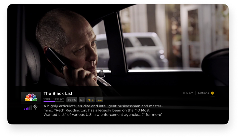
Designs of initial on-screen displays to show metadata for over-the-air content.

Included are the various states as over-the-air metadata does take time to be displayed.


Extending designs
It was obvious that the same designs had to work for content received via an antenna but also streamed (Over the top).


These screens illustrate the adaptability of the design systems in place. Each on-screen display state was carefully planned. If some states did not have enough data to fill a field, that space would collapse, and a more relevant field would take its place. In cases such as trick-play mode and loading states for pre-roll ads, the amount of information to be displayed is minimal.


Other types of on-screen displays (OSDs) were designed together to establish a strong visual language and create a logical composition.


Top row: When two different types of on-screen displays occupy the same space, I had to create a transition between them.
Bottom row: In this example, simply moving the original design of the on-screen display (OSD) from the bottom to the top solved the problem of displaying the focus state for the electronic program guide. Instead of creating a new UI pattern to solve it, this simple change did the trick.
Achieving Impact and Recognition

The expansive exploration of an overlay system yielded significant outcomes. Years later, my work became a reference point and eventually made it into the product roadmap with dedicated resources.
One pivotal moment was when I presented the design to a panel of executive staff, receiving direct feedback from the CEO. He praised the forward-thinking approach and highlighted its potential to enhance user engagement significantly.
This recognition increased our team's visibility and demonstrated my initiative and willingness to engage with leadership. This project exemplified how collaboration with cross-functional teams can lead to more meaningful and impactful work beyond simply taking feature requests at face value.